 Click here to see us on Facebook
  Follow Me on Pinterest
A wonderful pearing
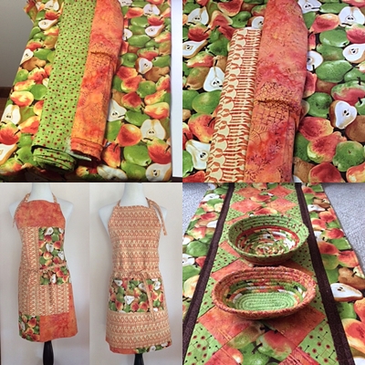 As soon as I spotted this wonderful pear fabric I knew it would make not only a good apron but also a nice runner...YEAH. Why yeah? It was in with the sales fabrics along with the two matching batiks and at this particular store, one is required to buy a yard of sales fabric, With careful planning and cutting I could not only make a color block apron but also a runner AND some bowls. I was also pleased when I got the fabric home and discovered a matching lime fabric in my stash.
The decision was made to use the grouping of fabric on the right for the apron since I felt the lighter colored batik was more"wearable" and the grouping on the left for the runner, since I wanted it to "pop". Ever though the lime fabric did pop more than the lighter batik that I had used for the apron, what I discovered once I had finished the patchwork part of the runner is that the 3 fabrics had the same hue so it was not popping. Contrast is what makes things pop. What could I do at this point? I know, I can add a small inner border between the patchwork and outer border. I dug through my stash and found this VERY bright orange that matched the brightest color is the pear fabric but it just wasn't doing it for me. I recalled this bit of brown swirl fabric left over from another runner and when I put it all together with the outer border on my design wall it was exactly the contrast the runner needed. I had not visualized the lack of contrast during the planning stage. Of course, I failed to take a picture of the layout without the brown border but trust me....it lacked the pop factor and perhaps looking at the photo of the finished runner you can visualize it without it. I felt just like Goldilocks once I had it all laid out on my design wall....not too hot, not to cold, just right!
- Sandy's blog
- Log in to post comments