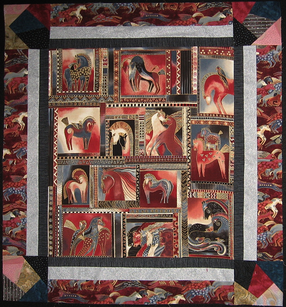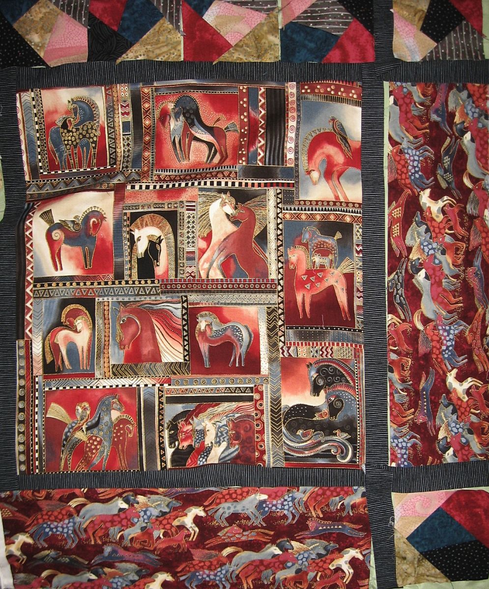
 My next project.....making a wall hanging from this glorious Dancing Horses panel by Laurel Burch. I found myself in a quandary on how to border it. I immediately attached a small 1" border using a black tone on tone striped fabric but then I couldn't decide; do I make a crazy quilt border or use the other dancing horses fabric that has the burgundy background.? This is a very strong panel with a lot going on so I needed to be careful not to make the border too busy, I posed this question to my friend Margaret after I posted the photo on the right on facebook with both borders and the panel that I had put up on my design wall. She liked the crazy blocks but since this wall hanging is going to be for sale, I questioned whether people would be willing to pay the extra for the labor intensive 22 blocks I would need to make for the border. She then suggested a triple border. That seemed like a good solution so I went to my favorite fabric store that is also the closest to my house (25 miles away) and lo & behold, they were having a 20% off sale...cool beans. I pulled a few fabrics and did a fast layout with each and got it down to my two favorites but could not decide. Since it was a sale, there were plenty of fellow quilters available for a consult and it was unanimous...the one with more contrast., a lovely bluish/silver fabric that had metallic silver swirls. I had already decided to use the crazy quilt blocks as cornerstones. Now that I have put the two photos side by side, I do think Margaret had given good advice. The black and silver borders separate the burgundy horse fabric just enough that it stands alone on itself and adds rather than detracts from the panel. I also am glad i added the crazy blocks in the corners....it is nice to have friends who can give you good advice. Thanks Margaret!


Comments
Wall hanging
Just doing the crazy blocks in the corner was a great idea. Let's the focus fabric shine while still being interesting.
Border choices
I like the final decision. The crazy blocks would have competed with the focus fabric if they were the whole border. Using in the corners was a good idea.
wall hanging
Thanks for your comment. Having a design wall allowed me to stand back from the panel and I could clearly see that the black and silver border was going to work nicely. I realy love this Dancing Horse fabic is is the second wall hanign I have made using it!
Border choices
Hi Holly...it is always difficult to balance art with what I call the material question....I want the piece to have the proper integrity but I have to balance it with the amount of time and what I can actually charge for the piece. With the advice I got from my friend Margaret, I was able to happily archive both. In this case, simpler was better. Thanks for your comment!